| Author |
Message |
 cnladueVeteran Member cnladueVeteran Member
Posts: 257
Joined: 20 Mar 2008
Location: sacramento
|
|
 Posted: Tue Jun 10, 2008 11:11 am Posted: Tue Jun 10, 2008 11:11 am |
 |
|
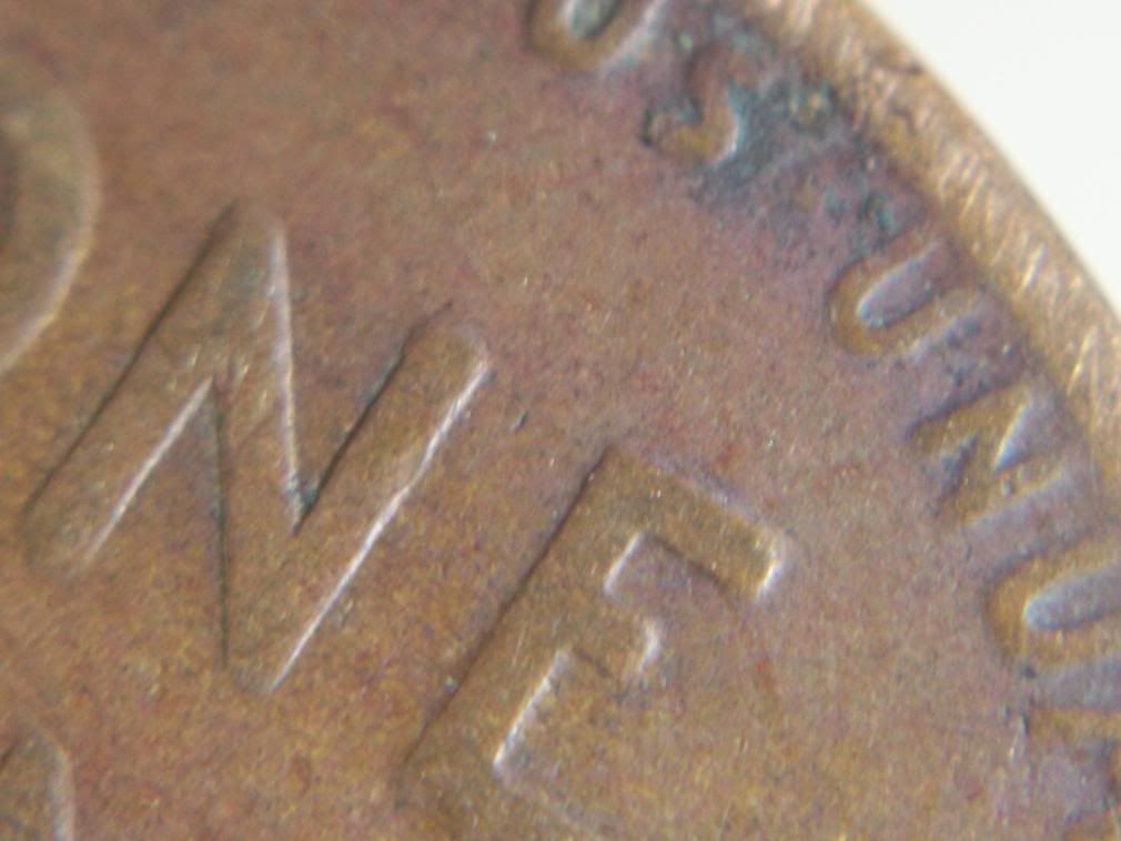
still trying for a new one here- 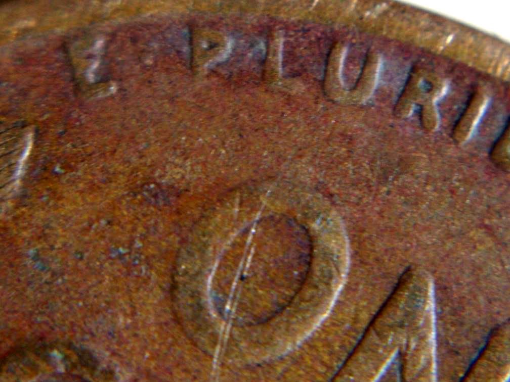
_________________
The opinions that I express do often reflect stupidity.
|
|
|
|
|
 |
 coppercoinsSite Admin coppercoinsSite Admin
Posts: 2809
Joined: 29 Jun 2003
Location: Springfield, Missouri.
|
|
| Posted: Tue Jun 10, 2008 7:59 pm |
|
|
For a new what?
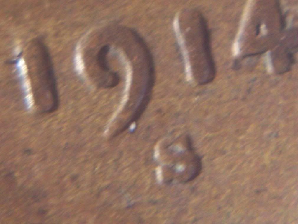
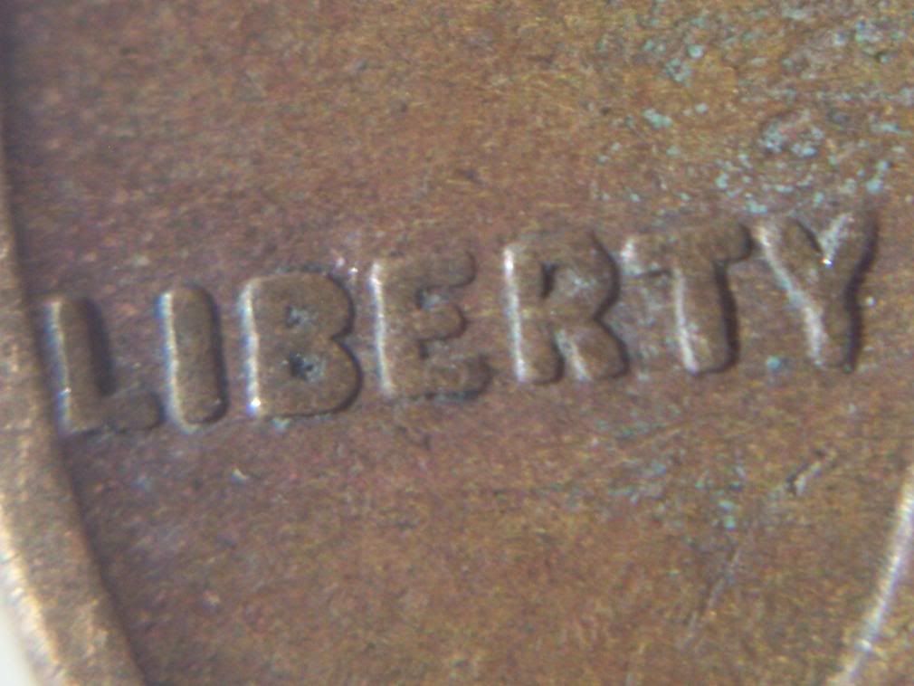
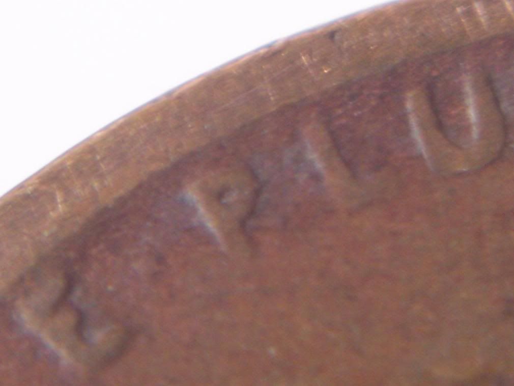
Although it's a nice coin (any 1914S is a nice coin), I see nothing more than some random shots of a coin here. If you see something you think is outside the norm, please point it out.
_________________
C. D. Daughtrey
owner, developer
www.coppercoins.com
cd@coppercoins.com
|
|
|
|
|
|
cnladueVeteran Member
Posts: 257
Joined: 20 Mar 2008
Location: sacramento
|
|
| Posted: Wed Jun 11, 2008 1:15 am |
|
|
I WAS HOPING THE L WAS A BIT POINTED and the u was a tiny weeny bit fat at the bottom....but i was just hoping...
_________________
The opinions that I express do often reflect stupidity.
|
|
|
|
|
|
coppercoinsSite Admin
Posts: 2809
Joined: 29 Jun 2003
Location: Springfield, Missouri.
|
|
| Posted: Sun Jun 15, 2008 8:11 am |
|
|
Nope...I don't think so.
One thing to remember is that the letters are trapezoids..beveled edges that are fatter as you go straight down from the tops of the relief to the field. When the coin is worn down, the letters will naturally look a little fatter than a coin with more detail.
Another thing is that heavy wear tends to beat the letters down a little and make them look somewhat fatter anyway.
I think we have a case of looking to hard to make something that's not there. I would sugget backing off a bit and looking a little more quickly until you get the full hang of it. Instead of trying to discover something that's never been discovered as a rule, get some 1936 cents and look on the reverses for the thickness until you know exactly what you're looking for.
_________________
C. D. Daughtrey
owner, developer
www.coppercoins.com
cd@coppercoins.com
|
|
|
|
|
|
|


